The openaq package provides functionality for visualizing data
through the built-in R base::plot package (see
vignette(“plotting”)). A popular alternative package for creating data
visualizations is ggplot2, known
for its declarative API and ease of use for creating highly customized
plots. The openaq package automatically provides data
output as a data frame, making it straightforward to integrate openaq
with ggplot2.
To demonstrate how to use ggplot2 with
openaq, we will query PM2.5 measurement
data.
We will query data from sensor 12235029, a PM2.5 sensor located in Delhi, India, for May 2025. We make sure specify the correct timezone (Asia/Kolkata) to ensure we query datetime in the local time of the location.
pm25_data <- list_sensor_measurements(
  12235029,
  datetime_from = as.POSIXct("2025-05-01", tz = "Asia/Kolkata"),
  datetime_to = as.POSIXct("2025-05-31", tz = "Asia/Kolkata")
)
head(pm25_data)
## value parameter_id parameter_name parameter_units period_label
## 1 78 2 pm25 µg/m³ raw
## 2 78 2 pm25 µg/m³ raw
## 3 78 2 pm25 µg/m³ raw
## 4 78 2 pm25 µg/m³ raw
## 5 80 2 pm25 µg/m³ raw
## 6 91 2 pm25 µg/m³ raw
## period_interval datetime_from datetime_to latitude longitude
## 1 00:15:00 2025-05-01 00:45:00 2025-05-01 01:00:00 NA NA
## 2 00:15:00 2025-05-01 01:00:00 2025-05-01 01:15:00 NA NA
## 3 00:15:00 2025-05-01 01:15:00 2025-05-01 01:30:00 NA NA
## 4 00:15:00 2025-05-01 01:30:00 2025-05-01 01:45:00 NA NA
## 5 00:15:00 2025-05-01 02:30:00 2025-05-01 02:45:00 NA NA
## 6 00:15:00 2025-05-01 02:45:00 2025-05-01 03:00:00 NA NA
## min q02 q25 median q75 q98 max avg sd expected_count expected_interval
## 1 NA NA NA NA NA NA NA NA NA 1 00:15:00
## 2 NA NA NA NA NA NA NA NA NA 1 00:15:00
## 3 NA NA NA NA NA NA NA NA NA 1 00:15:00
## 4 NA NA NA NA NA NA NA NA NA 1 00:15:00
## 5 NA NA NA NA NA NA NA NA NA 1 00:15:00
## 6 NA NA NA NA NA NA NA NA NA 1 00:15:00
## observed_count observed_interval percent_complete percent_coverage
## 1 1 00:15:00 100 100
## 2 1 00:15:00 100 100
## 3 1 00:15:00 100 100
## 4 1 00:15:00 100 100
## 5 1 00:15:00 100 100
## 6 1 00:15:00 100 100In this exercise, we will demonstrate how to plot both a box plot and
a histogram with ggplot2. The plots are common
visualizations for exploring air quality measurement data and will serve
as guides for working with ggplot and openaq.
A box plot illustrates the distribution of PM2.5 values in
May 2025. It shows the median, interquartile range, and helps identifies
outliers in the dataset. This chart can help us understand the overall
spread and average levels of particulate matter.
ggplot2 makes creating this kind of plot easy with it’s
ggplot2::geom_boxplot() function. Because the data from the
openaq is presented in long format and as a data frame we
can directly add the data to the ggplot2::ggplot() function
for charting.
ggplot(pm25_data, aes(x = "", y = value)) +
  geom_boxplot() +
  labs(
    title = "Summary of May 2025 Data in Delhi, India",
    y =  expression("PM"[2.5]~"Concentration ("*mu*"g/m"^3*")")
  ) +
  theme_grey()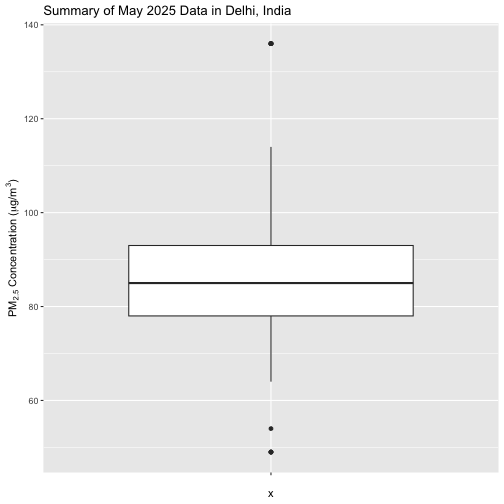
Now, let’s summarize the frequency distribution of PM2.5
values over the month. We will use a histogram, for which
ggplot2 provides the ggplot2::geom_histogram()
function. To calculate an optimal bin width for the histogram we can use
Scott’s Rule,
which adapts to the data spread and size.
scott_bw <- function(x) {
  (max(x) - min(x)) / nclass.scott(x)
}
This histogram provides a quick view of the overall distribution and skew of the data, highlighting standard value ranges and the presence of high-pollution events.
ggplot(pm25_data, aes(x = value)) +
  geom_histogram(
    binwidth = scott_bw(pm25_data$value)
  ) +
  theme_grey()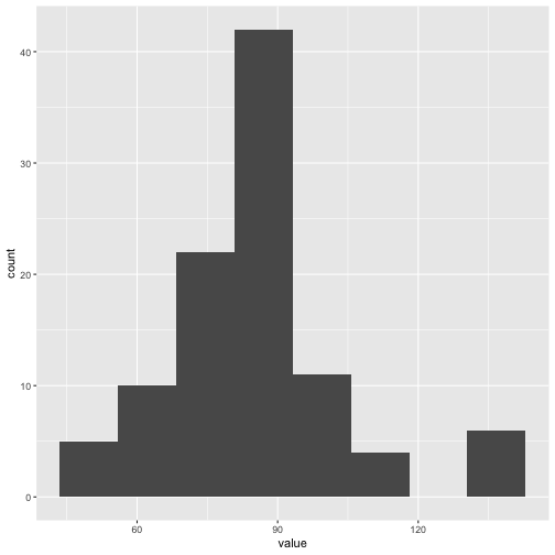
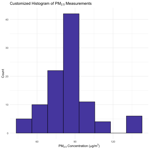
You can customize your histogram by changing the color and fill as shown below. This histogram highlights overall distribution and possible high-pollution events. You can further customize fill color, bins, and themes.
ggplot(pm25_data, aes(x = value)) +
  geom_histogram(
    binwidth = scott_bw(pm25_data$value),
    fill = "#584DAE", color = "black"
  ) +
  labs(
    title = expression("Customized Histogram of PM"[2.5]~"Measurements"),
    x = expression("PM"[2.5]~"Concentration ("*mu*"g/m"^3*")"),
    y = "Count"
  ) +
  theme_minimal()